“Football’s Play To Win” CGI Using Ross Xpression

I have been working with the Ross Xpression system for a number of years now for the local television show “Football’s Play To Win“. The show was originally produced on campus using students as part of the Chattahoochee Technical College Television Production Technology program. The show airs on Fox 5 in Atlanta during the football season. Because of COVID-19, the show was moved to a fully remote format, but I still continue to do the graphics for the show.
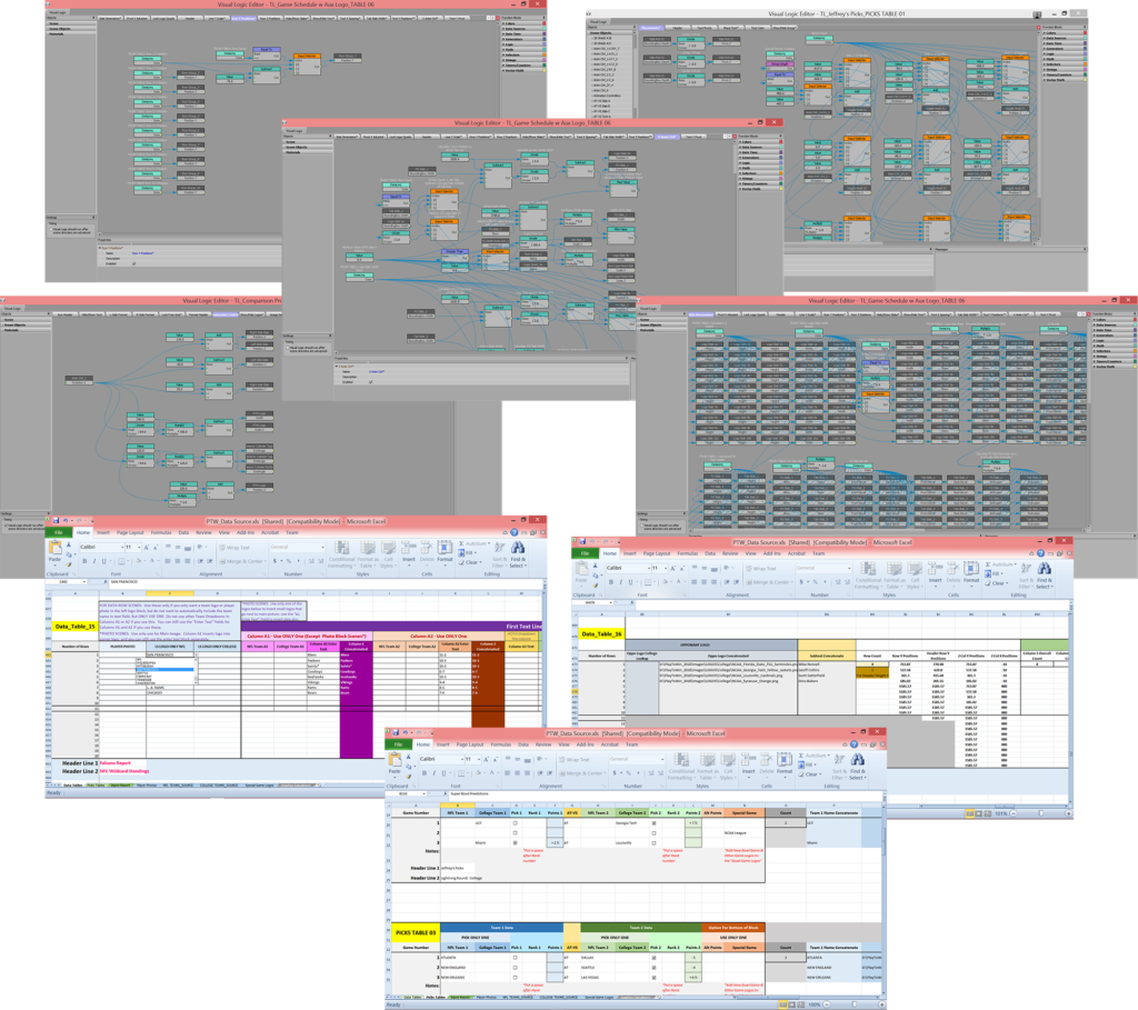
I designed and built the Xpression graphics package for the show, and I also trained students to operate the Xpression CG for the show after the first season. Most television students are more interested in the video production aspect, and don’t have a lot of interest or training in graphic design or specifically in the Xpression graphics development. It was a challenge to build infographics that were self-formatting using Visual Logic, so that students didn’t have to learn the entirety of Xpression in order to get some experience as operators during the show. Ultimately, creating these 3D object based self-formatting templates (so we didn’t have to custom build 2D image based graphics for every show) cut the preparation time from 2 to 3 days down to a matter of only 2 to 4 hours per week.
Because of budget constraints, the show doesn’t license any game footage, so I made an extra effort to make the graphics a little more lively to compensate for the lack of visual variety during the show.

Full Screen Info Graphics
These are examples of some of the full screen graphics created for the show. I designed them to be flexible to be able to input a wide variety of information in different formats. One of the challenges with designing templates for the show was that each week, the type of information they chose to display could vary quite a lot.
Full Screen ‘Data List’ Graphics
A lot of the data that was covered in the show was presented in the form of lists. There was no fixed number of data points, so the type and number of data points could vary widely. So, to be able to handle this variability, I designed these templates to format themselves based on the date input into the Excel spreadsheet. I used lookup tables containing unique dimensions for each potential layout to drive the graphics, and the lookup was based on the quantity of data sets input into the tables. The team names, logos and photos were also input into the graphics via drop-down selections and lookup tables in order to minimize the potential for typos and errors.
Lower Thirds & OTS
The lower thirds are templates, and the data is input into the sequencer manually. The one over-the-shoulder graphic uses Excel tables to input the player data.